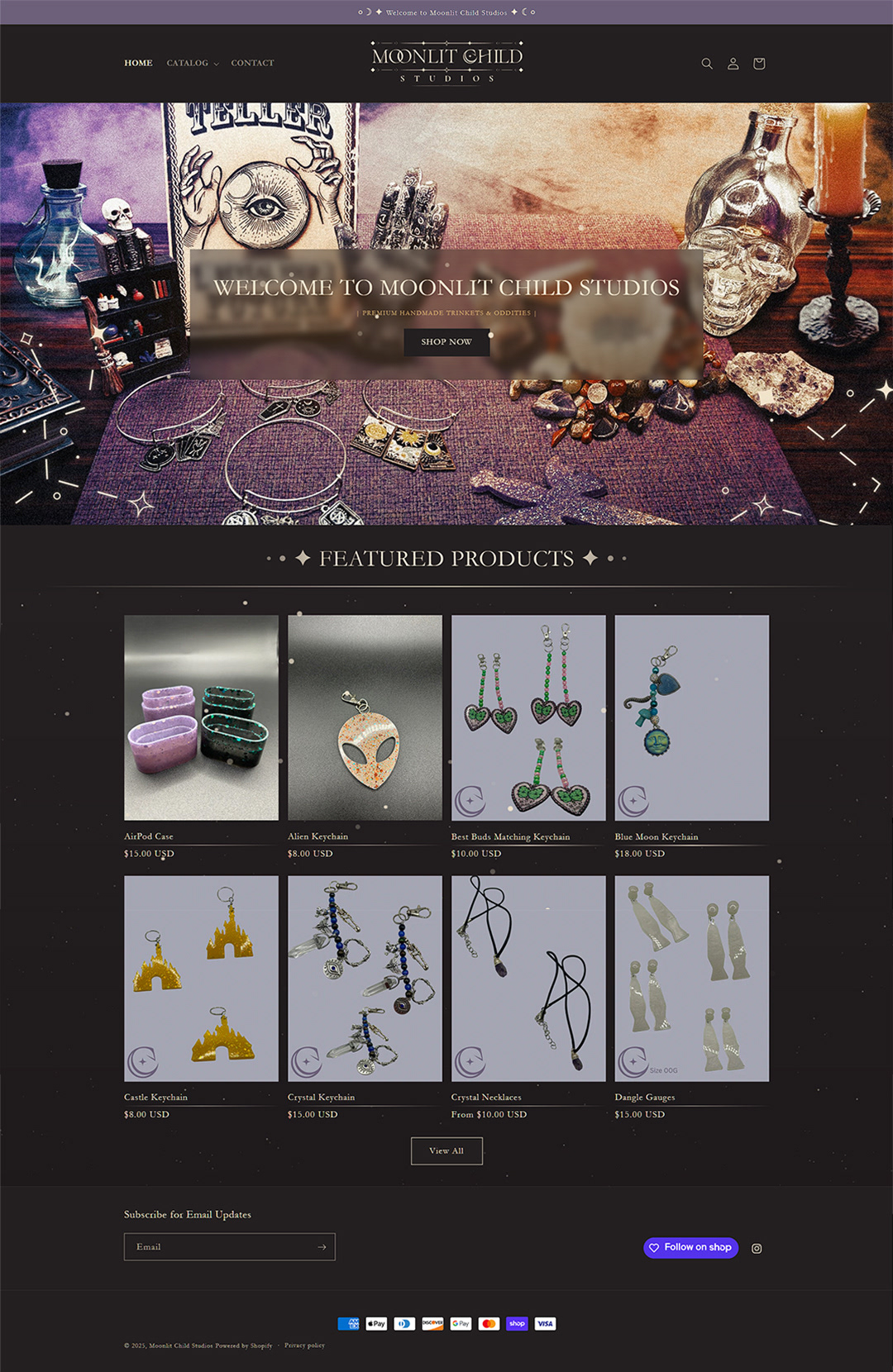
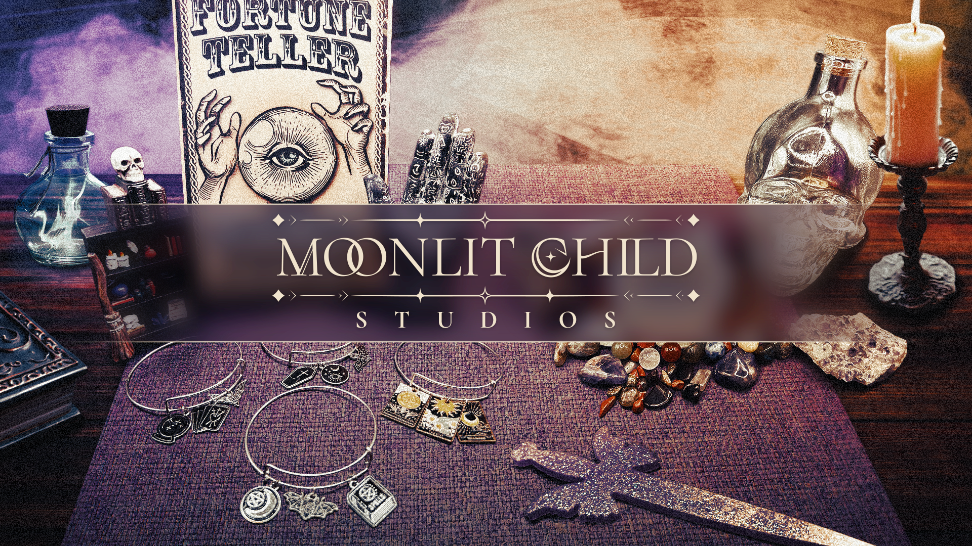
— Brand work for a small, local Arizona business focusing on custom, made-to-order trinkets and oddities such as jewelry, resin pieces, and various other curios with a highly stylized visual identity.
INITIAL THOUGHTS
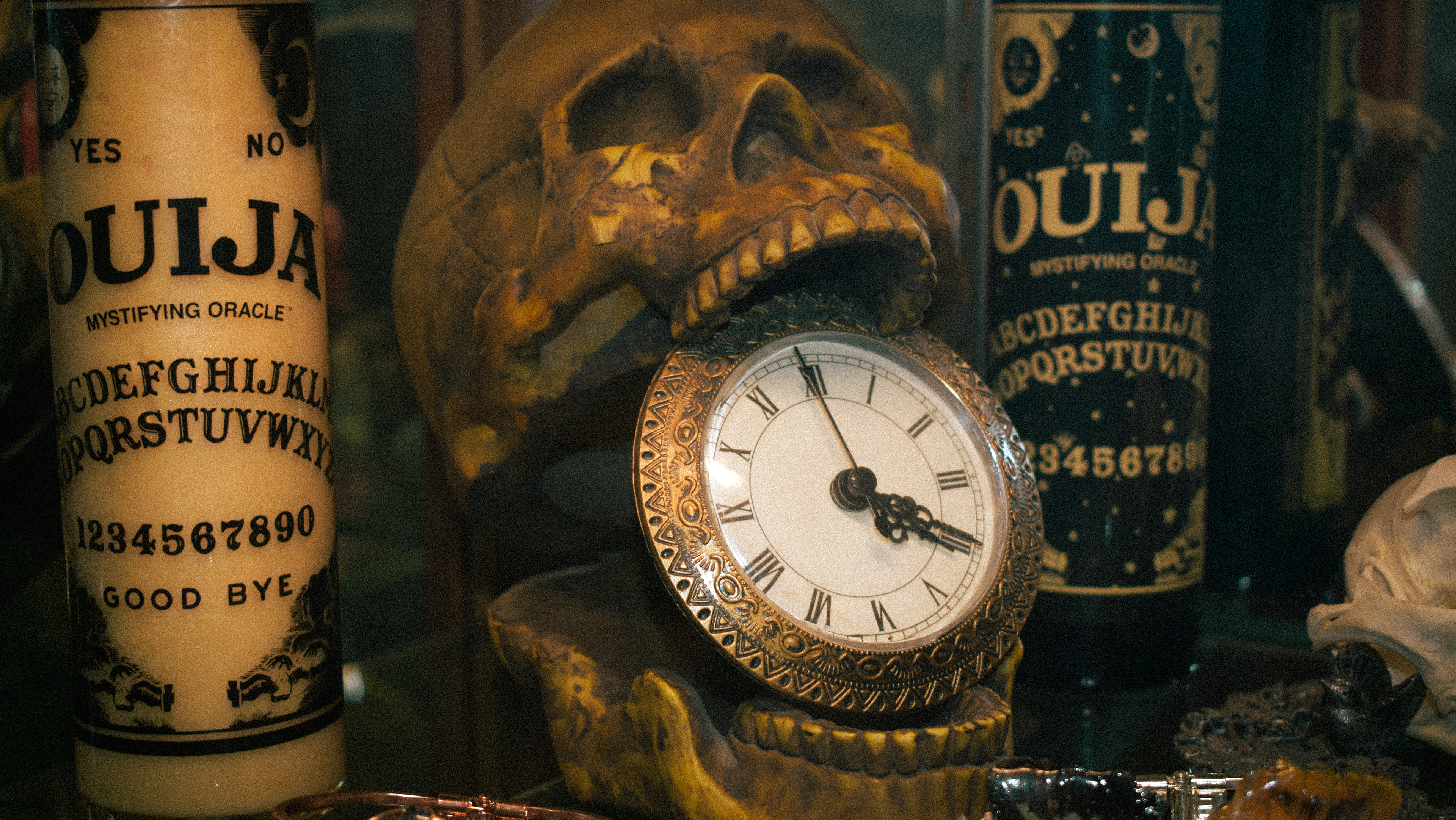
— The design goal for the overall brand visuals were to blend together a very clean, modern style, with a tight influence of tarot-inspired, mystical imagery. This fits in-line with the style and alt-nature of the products the business produces. It was important when strategizing concepts to keep the identity personable to the founder, Sarah.
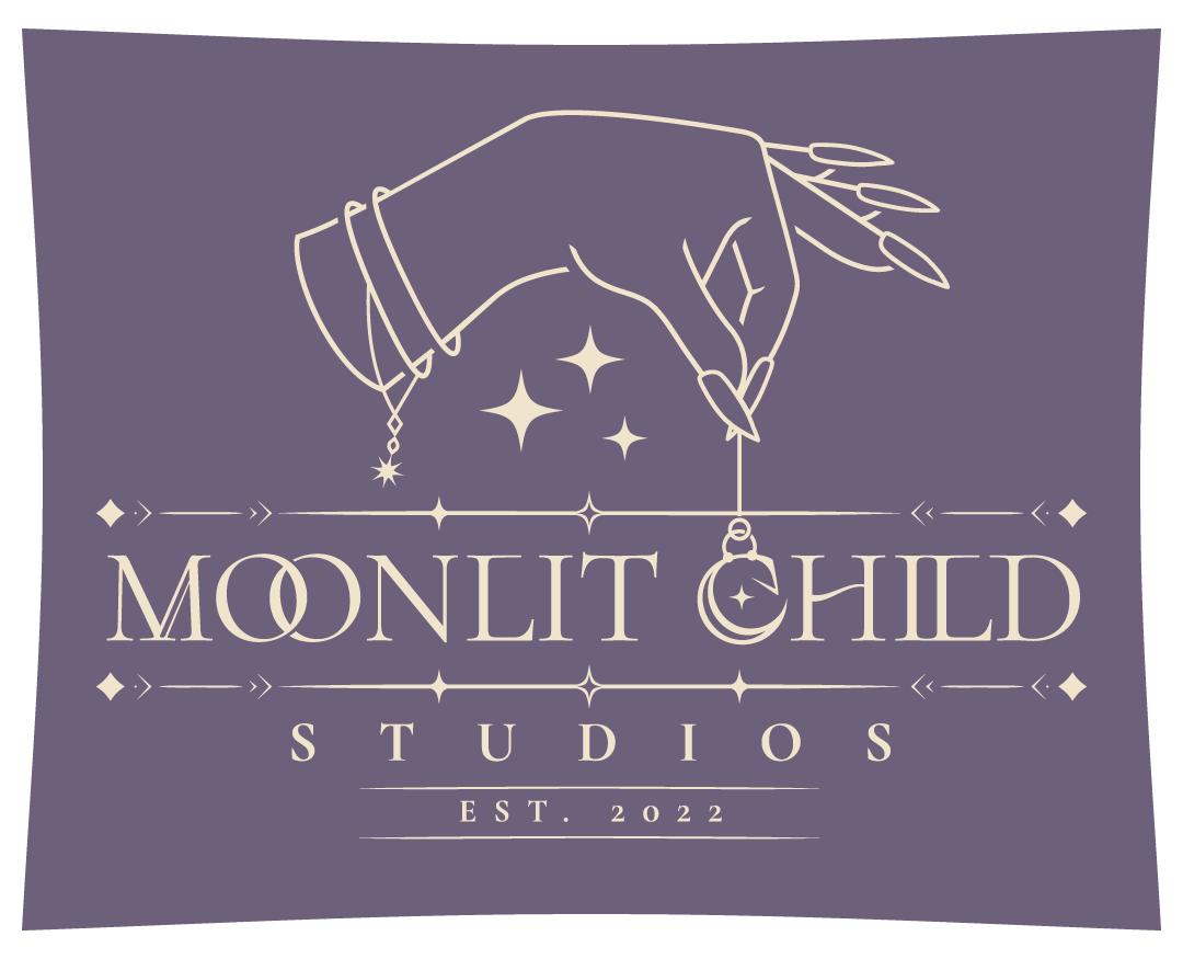
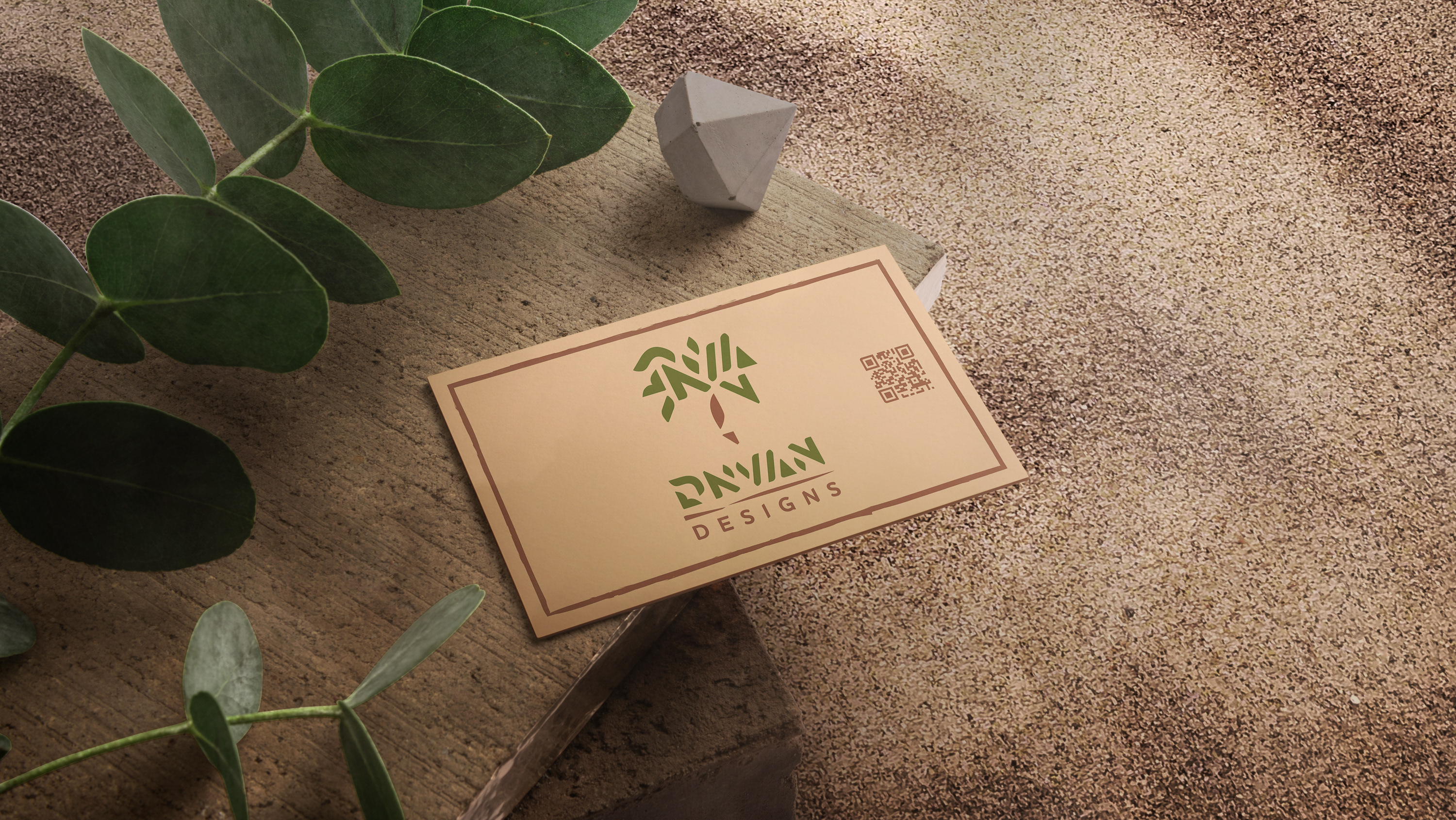
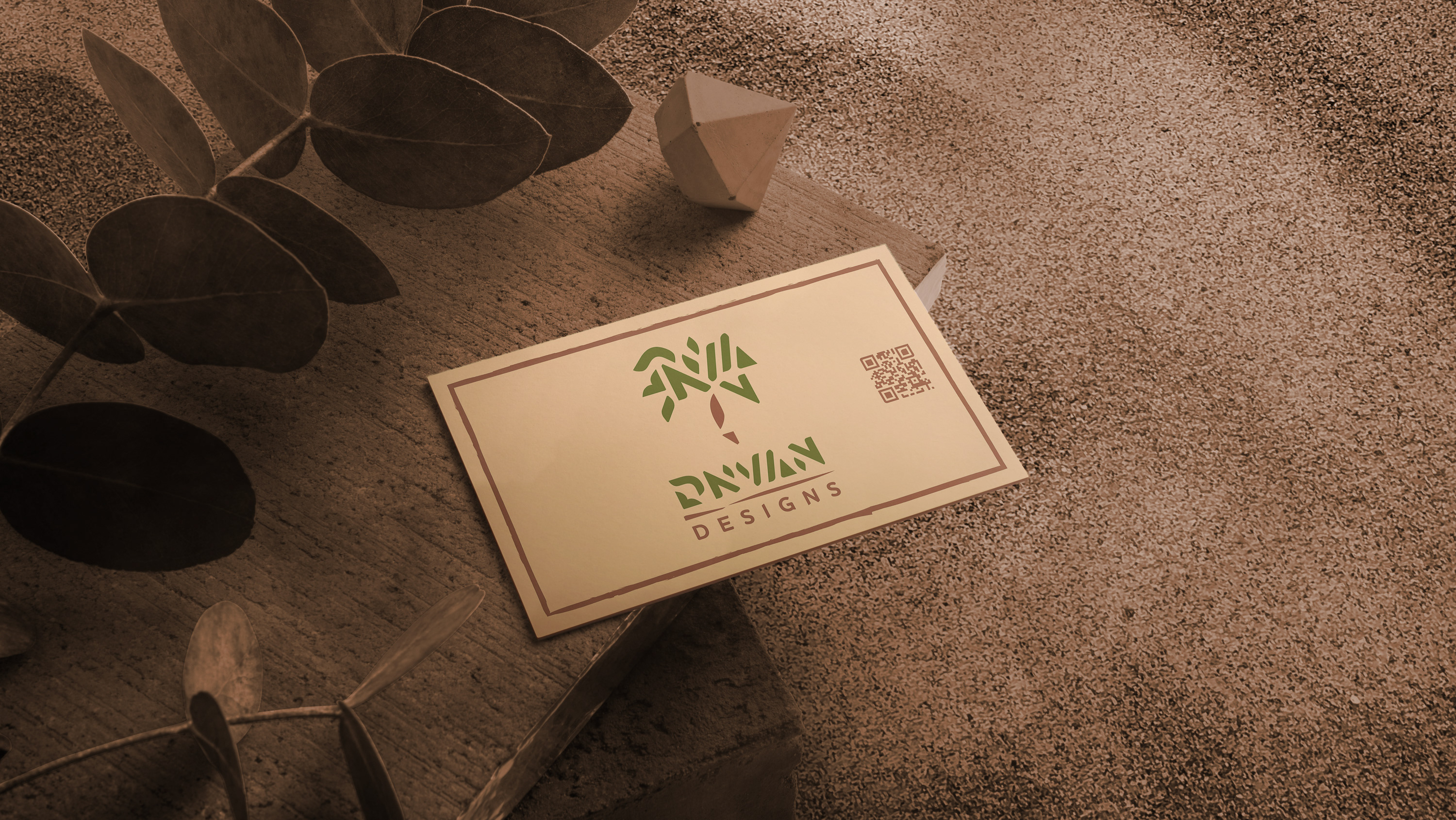
THE LOGO
— Being the visual that lives at the heart of the brand, it was important for me to craft a design that set an established theme and niche with a major focus of personability.
THE Color PALETTE
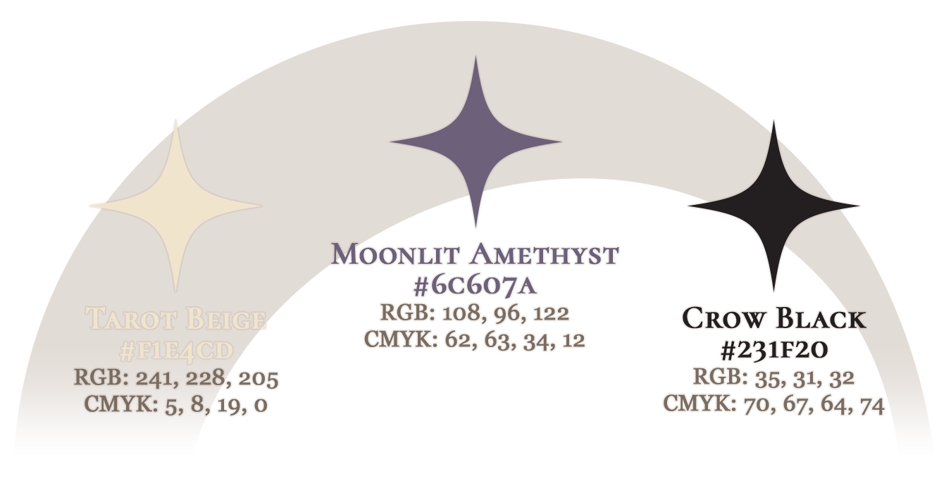
— This is the core primary color palette for Moonlit Child Studios, these are the colors that define the overall feel of the brand. Any materials containing usage of brand assets are recommended to have present at least 1 of 3 colors in any given design*
*Exception being Solid White (#FFF) or Solid Black (#000) for usage such as embedded icons digitally or printed, or wheRever color is not a primary focus.
THE TYPEOGRAPHY
— PRIMARY FONT - Cormorant SC Bold
ABCDEFGHIJKLMNOPQRSTUVWXYZ
1234567890!?@#$%&
— Cormorant SC Bold is the primary font, it is to be used for the "Moonlit Child" part of the company's name, as well as the main header typeface on web pages, social media posts, and any other digital or printed materials.
— SECONDARY / Web-Safe FONT - Georgia
ABCDEFGHIJKLMNOPQRSTUVWXYZ
1234567890!?@#$%&
— Georgia is the secondary font, it is to be used for the "Studios" part of the company's name, as well as sub-header and body typeface, and used on any digital or printed materials containing these.
WEBSITE DESIGN